21 Interesting Accessories to Make Your Bookshelves Wow
Jul , 7


 The toughest decision to make for a design project is probably the appropriate colour scheme for specific spaces. Based on the wheel, there are a few basic rules to match colors. This is because colour is so vast, so many options to choose from!
Also, not all colours will complement each other so it’s a task to put together colours that will successfully harmonize and set off the right energy that you’d like your space to give!

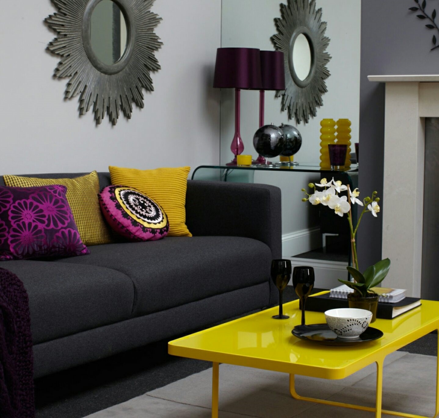
Rule #1: 60-30-10
The first rule is the 60-30-10 rule where you have the dominant colour, the secondary colour and the accent colour. The dominant colour is the focal colour of the space. It is preferable to use a subtle, neutral colour that isn’t overwhelming. The secondary colour is a bit bolder and the accent colour, as the name implies should be the brightest of them all.
The picture above illustrates this rule. Here the dominant colour is the white, on the walls and some of the woodwork, the secondary colour is the dark gray portrayed mostly by the sofas and the yellow is used as the accent colour.


Warm and Cool Colours
The Second rule has to do with warm and cool colours. Colours are popularly classified into these two categories. Brighter colours like shades of red, orange, etc are called warm colours. Shades of blue, green, etc are cool colours. This rule is about knowing the kind of mood you want a space to set. Warm colours are often used in spaces to stimulate excitement while cool colours are more subdued and should be used in workspaces, bedrooms where calmness is appreciated.
The Complementary Colour Scheme
This third rule is the most basic guideline to use as it only involves two colours. On the colour wheel, complementary colours are the two colours that are opposite each other so if you want to go simple, apply this rule! Blue complements Orange, Red complements Green and Yellow complements Purple. Pretty straightforward right?! However, in Using this rule, always have a neutral colour to balance them out because these colours may sometimes seem a bit much.
Analogous Colour Scheme
This rule also involves the colour wheel but a different principle than the complementary colour scheme. With this one, you can match a selected central colour with the two colours by its side on the colour wheel. They can be used in the 60-30-10 method. With this rule, you could implement different shades of the same colour to spice things up. This rule is a bit tricky and may have your space looking a little too forthcoming as it takes a lot to make these colours properly flow into one another
But, there’s the option of a monochromatic colour scheme for lovers of subtle and minimalist design where you can play with neutrals black, white and gray to give your space a sleek modern look.
We bet this was an interesting read for you and very informative too. Check out our article on interior Design: The 7 Elements of Interior Design. Don’t Drop your comments let’s know what you think!